DocsGetting started
Reading the dashboard
What every number on the ASO Atlas dashboard means, from the headline stats to the IMPR 30D, TOP 10, TOP 50 and VIS 7D columns per app.
The dashboard is your daily one-glance answer to "how is my ASO going?". It puts a keyword search box front and center and compresses each tracked app into a single row of signals. This page explains what each number means and, more importantly, what to do when it moves.
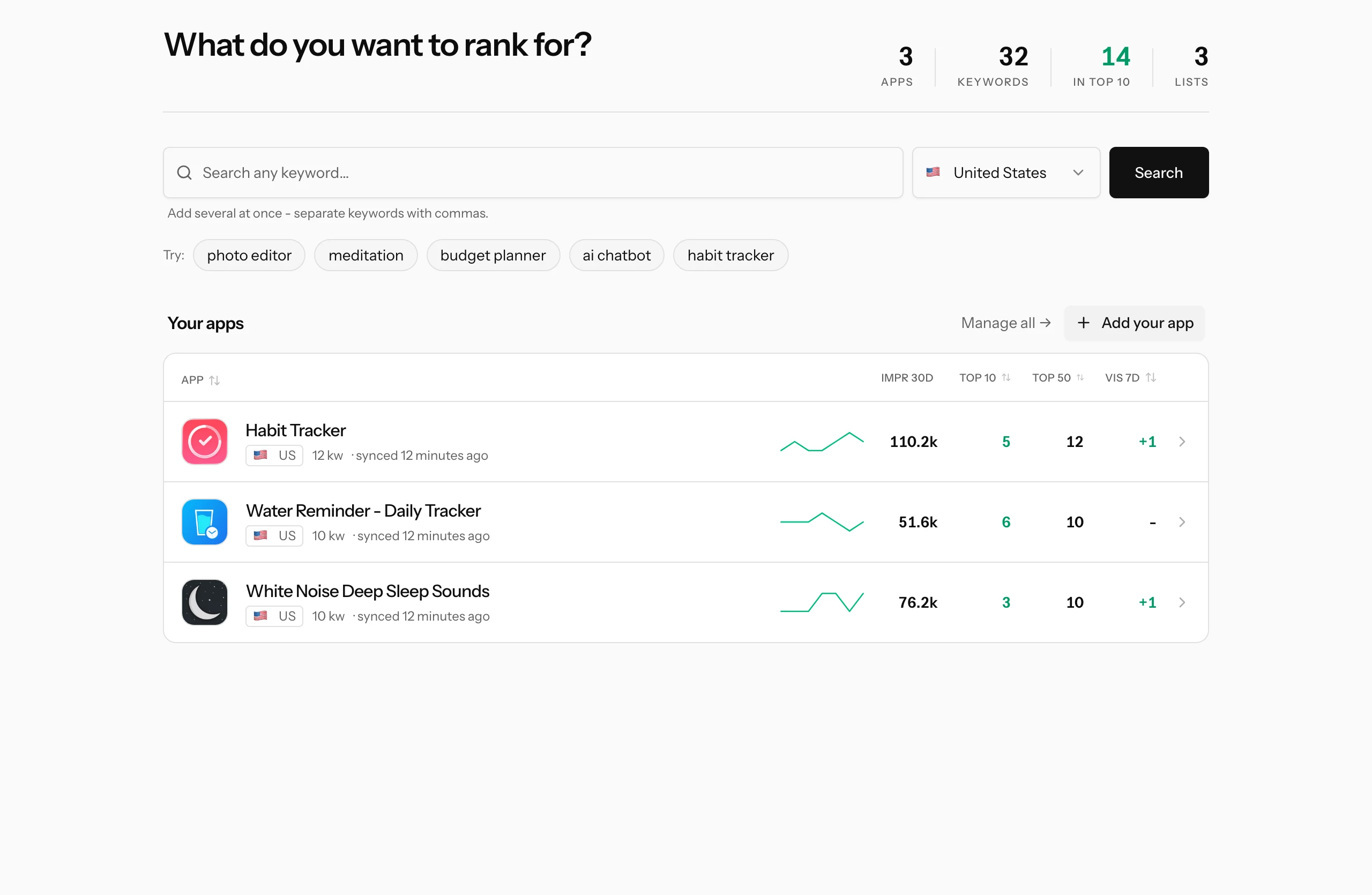
The headline stats
The top-right corner sums up your whole portfolio:
- Apps: how many apps you track.
- Keywords: the total number of tracked keywords across all of them.
- In top 10: how many of those keywords currently rank your apps in the top 10 of their search results. This is the number that pays rent; it turns green as soon as it is above zero.
- Lists: how many keyword lists you have saved. It only appears once you have at least one, and clicking it jumps straight to your lists.
If "in top 10" is a small fraction of "keywords", that is not failure, it is a to-do list. The gap is where your next metadata work lives.
The keyword search box
The big search box is the fastest way into keyword research, no app required. Type any keyword, pick a country, and you get its popularity, difficulty and the apps currently ranking for it. Paste several keywords separated by commas to compare a whole batch in one table. The suggestion chips underneath are one-click examples if you just want to see how it works.
This is the same research engine described in your first keyword research session; the dashboard just keeps it one keystroke away.
The Your apps list
Each tracked app is one row. The left side identifies it: icon, name, the storefront flag, how many keywords you track for it, and when its store data was last synced. The right side is the scoreboard:
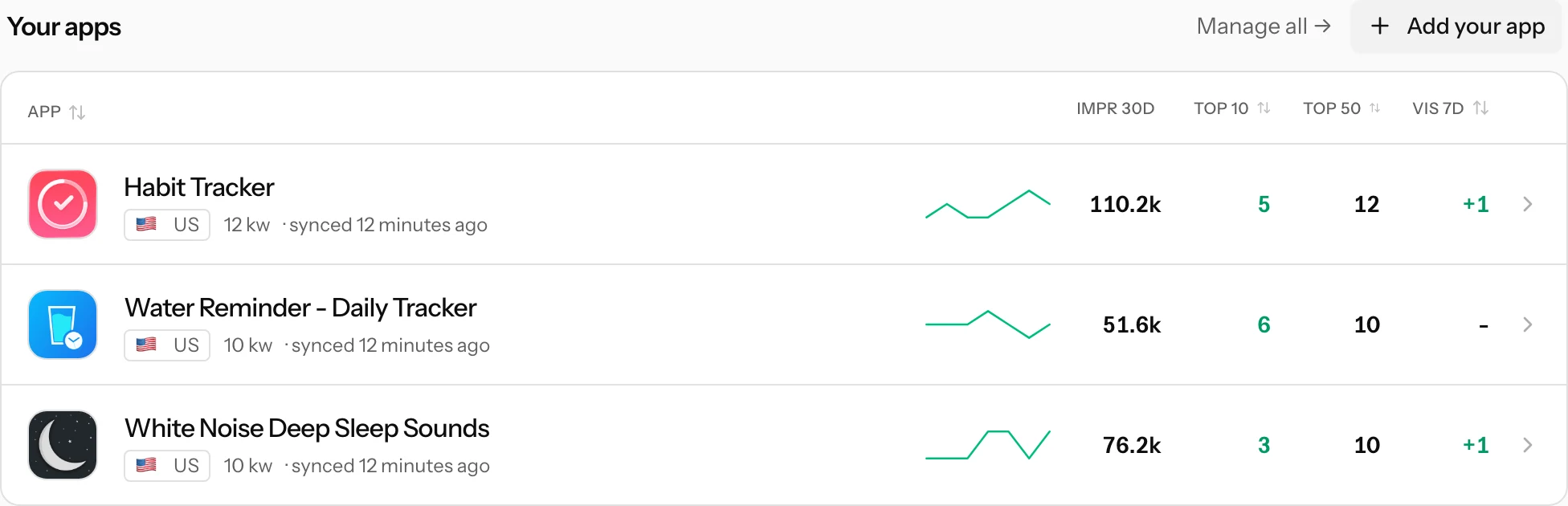
- Trend sparkline: your top-10 keyword count at the end of each of the last seven days. A rising line means more of your keywords reached the first screen of results; it needs at least two days of ranking history to draw.
- IMPR 30D: how many times your app was seen on the App Store over the last 30 days. This is real data from your own App Store Connect account, connected under Settings, then Integrations. A dash means the app has no analytics connection yet.
- TOP 10: how many of the app's tracked keywords rank it at position 10 or better in their latest daily check. These are the keywords already bringing meaningful traffic.
- TOP 50: the same count for position 50 or better (it includes the top-10 keywords). Keywords in the top 50 but not the top 10 are your near-wins: you have a foothold, and a metadata push can move them onto the first screen.
- VIS 7D: the change in your top-10 count across that seven-day window, so the same story as the sparkline as one number. +2 means two more keywords entered the top 10 than left it; a red negative means you lost ground. A dash means no change, or not enough history yet.
Click any column title to sort by it (click again to flip the direction), and once you track more than three apps a filter box appears so you can find one by name or country. Clicking a row opens the app's full page with every keyword, described in rank tracking.
Turning the numbers into action
- VIS 7D dropped? Open the app and check which keywords fell and who overtook you. Daily wobble of one position is noise; a keyword leaving the top 10 for several days is a signal.
- TOP 50 much bigger than TOP 10? That gap is your best hunting ground. Best opportunities ranks those near-wins for you automatically.
- IMPR 30D flat while rankings improve? You may be climbing on low-traffic keywords. Use the search box to check the popularity of what you rank for.
If you have not set up an app yet, start with the quick start; the dashboard fills itself in from there.